When the Sky Is the Swatch: Testing Styling Colours in Real November Light
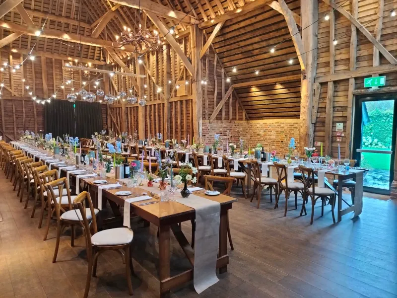
A few years back I stood in a Surrey barn at twenty to four, holding a stem of eucalyptus next to a sample of oatmeal linen, and watched both of them disappear. Not literally, obviously. But the green went navy, the linen went grey, and the whole arrangement looked like a photocopy of itself. The client had approved the palette in a warm showroom at eleven in the morning. By late afternoon, in the actual room, it had become a rumour of a colour scheme.
That is the thing about November light in the UK. It is not just dimmer. It is cooler, flatter and shorter. It arrives late, leaves early and spends most of the afternoon looking like the inside of a cloud. If you choose natural styling colours under summer sun or shop lighting, you are not choosing for the day. You are choosing for a day that does not exist.
The light you actually get
From November onward, most UK venues serve up a steady diet of blue-grey. North-facing rooms go soft and shadowless. West-facing barns get a brief, low flare around three o'clock and then a quick slide into dusk. Village halls with fluorescent tubes add a greenish cast that no one warns you about. Marquees, even heated ones, tend to read cold at the edges and warm only where the lights cluster.
None of this is bad news. Flat light can be flattering. It hides clutter, softens hard edges and makes texture do more of the talking. But it does not forgive certain colours. Acid green, brilliant white, pale pink and anything with a hint of yellow can turn sour or washed out. Deep burgundy, grey-green, smoked glass, aged brass and oatmeal wool tend to hold their nerve.
Build a grey-day board, not a mood board
A mood board is for dreaming. A grey-day board is for testing. Take a piece of mid-grey card, roughly A3, and treat it as your portable November sky. On it, place three or four small samples: a leaf, a fabric offcut, a piece of tableware, a scrap of ribbon. Do not arrange them prettily. Just place them side by side and look.
The grey card matters because it removes the warm bounce of a wooden table or a cream wall. It gives your eye a neutral reference. Add a strip of plain white paper at one edge, not to judge the colours against pure white, but to give your phone camera something honest to lock onto later.
Test foliage first. Ivy, eucalyptus, dried hydrangea, rosehips, bay, rosemary. Notice which ones go black, which go blue, which keep a bit of life. Then fabric: linen, wool, velvet, cotton. Then tableware: a plate, a glass, a fork. The goal is not to find colours that look bright. The goal is to find colours that look deliberate when the light is not helping.
The late-afternoon visit
If you can only do one thing, do this. Visit the venue at the time your guests will actually be sitting down. In November, that is often three-thirty or four o'clock. Bring your grey-day board, your samples and a small torch or phone light for the corners. Stand where the table will be. Look at the window. Look at the ceiling lights. Look at the floor.
You are checking three things: value, temperature and contrast. Value is how light or dark the colour reads. Temperature is whether it leans warm or cool. Contrast is whether the colours separate from each other or merge into a grey soup. If everything sits in the same middle value, the table will look flat. If one element is much lighter or darker, it will anchor the whole scheme.
A useful rule: in November, go one shade deeper than feels comfortable in daylight. Not darker for the sake of drama, just deeper so the colour has something to say when the light drops. A pale sage that looks lovely at noon will often look like dishwater at four. A deeper olive will still look green.
Phone-camera checks
Your phone is a useful liar. It will try to warm up a grey scene, boost contrast and make the whole thing look better than it is. That is fine for sharing, but useless for testing. To get a more honest read, lock the exposure and white balance on the white paper. Turn off HDR if you can. Take a short video rather than a still, because video shows how the light shifts as you move around the room.
Then look at the video on a laptop, not just the phone. Check whether the colours still separate. Check whether the foliage looks alive or embalmed. Check whether the tableware disappears against the cloth. If it looks like a bruise in the van mirror, it will look like a bruise in the room.
Briefing clients and planners
Most clients do not need a lecture on colour temperature. They need a simple sentence that explains why the palette changed after the site visit. Try something like: 'At 3:45pm the west window gives about twenty minutes of usable light, so we are keeping the palette in the middle values and adding one warm element at table height.' That is clear, practical and not remotely precious.
Ask the venue for window orientation and a lighting plan. Ask whether the overheads are warm, cool or mixed. Ask what time the room will be dressed and what time the guests arrive. If you are working with an event planner, send a short light note with two or three sample photographs taken at the venue. Label them with the time. It saves a lot of guessing later.
The takeaway
The grey-day test is not about making November look like June. It is about making November look intentional. Choose colours that hold their shape when the light goes flat. Test them on grey card, at the right time, with the right camera settings. Then brief the humans so nobody is surprised when the room looks like the sky outside.
Natural styling should feel like it belongs to the day, not like it is waiting for better weather. A little testing now means the table still reads rich, textured and alive when the light is doing its best impression of a closed curtain.